Sharpe Ratio
Return per unit of risk — the number that turns a return series into a verdict
This is where the library turns from describing returns to judging them. A return on its own says nothing: 30% earned by taking wild risk is worse than 20% earned smoothly. The Sharpe ratio divides return by the risk taken to earn it, and it is the single most-quoted number in performance evaluation. It is also, quietly, just the mean return over the volatility — the first two moments, combined.
The equation
\text{Sharpe} = \frac{\bar r - r_f}{\sigma}
The mean return in excess of the risk-free rate, divided by the volatility of returns. Because both the numerator and denominator scale with the length of the window, the per-period figure is annualised by multiplying by \sqrt{252}.
What each symbol means
| Symbol | Meaning |
|---|---|
| \text{Sharpe} | the Sharpe ratio — excess return per unit of volatility |
| \bar r | the mean return of the asset or strategy |
| r_f | the risk-free rate over the same period (e.g. a T-bill yield) |
| \sigma | the standard deviation of returns — the risk |
| \sqrt{252} | the annualisation factor for daily returns (σ scales with \sqrt{\text{time}}) |
\bar r - r_f is the excess return — the reward for taking risk over the risk-free alternative. The Sharpe ratio pays you only for that.
Plain-English explanation
A return figure alone can’t tell you whether a strategy is good; you have to know how much risk bought it. The Sharpe ratio does exactly that: take the average return above what a risk-free asset would have paid, and divide by the volatility. A high Sharpe means lots of reward for the wobble you endured; a low — or negative — Sharpe means you weren’t paid for the risk.
As a rough guide, an annualised Sharpe near 1 is respectable, 2 is very good, and 3 is exceptional (and worth double-checking for overfitting). Because it is a ratio of two quantities that both grow with the window length, you annualise it so figures are comparable — daily Sharpe \times \sqrt{252}.
Why it matters in markets
The Sharpe ratio is the lingua franca of performance: allocators rank funds by it, risk teams budget by it, and every backtest reports it. It puts strategies of different volatilities on one axis — return per unit of risk — which is why it is the y-axis of manager selection. Two properties make it powerful: it is the slope of the line from the risk-free asset to your strategy in risk-return space (the figure below), and it is leverage-invariant — double your position and both excess return and volatility double, leaving Sharpe unchanged. So it measures the quality of a return stream, not its size.
Its blind spots matter just as much. It uses σ, so it penalises upside volatility as heavily as downside (the Sortino ratio fixes this), and it implicitly assumes returns are roughly normal — but the fat tails and negative skew we just measured mean a high Sharpe can still hide catastrophic tail risk. A short-volatility book can post a Sharpe of 3 for years and then lose everything in a week.
A simple worked example
Using the running three-return set [+2\%, -1\%, +3\%], with \bar r = 1.33\% and \sigma = 2.08\% (from Variance), and taking r_f = 0 for simplicity:
\text{Sharpe} = \frac{1.33\% - 0}{2.08\%} = 0.64 \text{ per period.}
If these were daily returns, annualising would give 0.64 \times \sqrt{252} = 10.2 — an absurd number, because three hand-picked returns are not a real sample. Which is precisely the point: a Sharpe ratio is only ever as trustworthy as the return series behind it.
Python implementation
import numpy as np
import pandas as pd

r = (pd.read_csv("../multi_daily.csv", index_col="Date", parse_dates=True)
       .pct_change().loc["2025-07-01":"2026-06-30"])["NDX"]

rf_annual = 0.04
rf_daily  = rf_annual / 252
excess    = r - rf_daily                                     # daily excess return
sharpe    = np.sqrt(252) * excess.mean() / r.std(ddof=1)     # annualised Sharpe
print(round(sharpe, 2))                                      # -> 1.46   (rf = 4%)

# rf = 0 shortcut (common on high-frequency data)
print(round(np.sqrt(252) * r.mean() / r.std(ddof=1), 2))    # -> 1.68
Two things to get right: annualise by \sqrt{252} (volatility’s factor), not 252, and use ddof=1. A Sharpe quoted without its window, its risk-free rate, and its return frequency is close to meaningless.
Manual / Excel calculation
By hand: take the mean and σ of the returns (as in the earlier entries), subtract the per-period risk-free from the mean, divide, then multiply by \sqrt{252}.
In Excel, with daily returns in B2:B252:
| Task | Formula |
|---|---|
| Daily excess mean | =AVERAGE(B2:B252) - 0.04/252 |
| Daily volatility | =STDEV.S(B2:B252) |
| Annualised Sharpe | =(AVERAGE(B2:B252)-0.04/252)/STDEV.S(B2:B252)*SQRT(252) |
Financial-market example — Nasdaq 100
The same window and basket, ranked by Sharpe — annualised return, volatility, and Sharpe at r_f = 0 and r_f = 4\%:
| Ticker | ann. return | ann. vol | Sharpe (rf 0) | Sharpe (rf 4%) |
|---|---|---|---|---|
| NDX | 30.7% | 18.2% | 1.68 | 1.46 |
| AAPL | 37.7% | 23.7% | 1.59 | 1.42 |
| NVDA | 30.1% | 35.4% | 0.85 | 0.74 |
| PEP | 8.8% | 22.0% | 0.40 | 0.22 |
| MSFT | −24.4% | 27.0% | −0.91 | −1.05 |
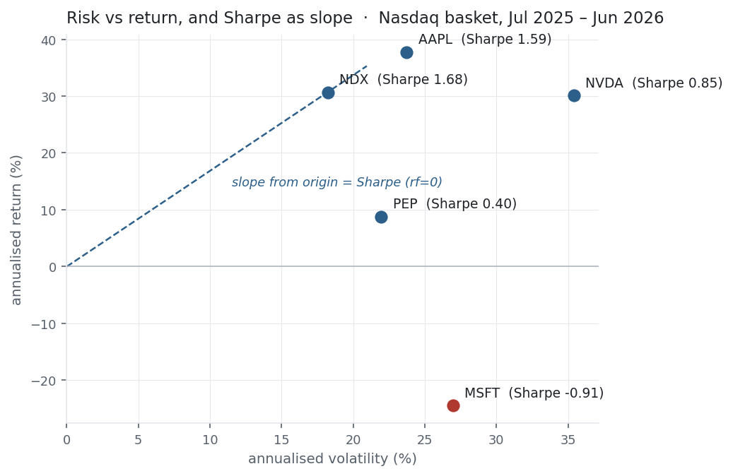
Read the Sharpe column instead of the return column and the ranking changes. NVDA earned almost exactly the index’s return (30.1% vs 30.7%) but at nearly double the volatility (35% vs 18%), so its Sharpe is barely half — same reward, far more risk. MSFT’s negative return makes its Sharpe negative: it wasn’t merely risky, it lost money. And the diversified index beats every individual name on Sharpe — the clearest possible illustration that diversification buys risk-adjusted return. In the figure, Sharpe is the slope from the origin to each point; steeper is better, and MSFT is the lone point below the axis.
Same multi_daily.csv as the previous entries (yfinance, adjusted closes). Code blocks are illustrative — every figure was computed and checked against that file.
Common mistakes
- Annualising with ×252 instead of ×√252. Sharpe scales like σ (√time), not like the mean; the wrong factor inflates it roughly 16×.
- Ignoring the risk-free rate. In a 4–5% rate environment r_f \neq 0 moves the number materially — 1.68 → 1.46 here. Always state which rate you used.
- Trusting a high Sharpe from a short or cherry-picked sample. The best Sharpe across many trials grows like \sqrt{2\ln N} even with zero real edge — see the backtest-overfitting experiment.
- Forgetting Sharpe assumes normality. Fat tails and negative skew mean a high Sharpe can coexist with severe tail risk; pair it with skew/kurtosis and drawdown.
- Penalising upside. σ treats big gains as “risk” too; for asymmetric strategies the Sortino ratio (downside deviation) is fairer.
- Comparing across frequencies. Daily, monthly, and annual Sharpes are not directly comparable unless every one is annualised the same way.